Personal Kite.
This project was a project where we were supposed to express ourselves in our shape, color, and design of a kite. The balance of my kite was asymmetrical. The color or colors my kite included were the following: pink, violet, green-blue, mint green, royal blue, swamp green and lavender.
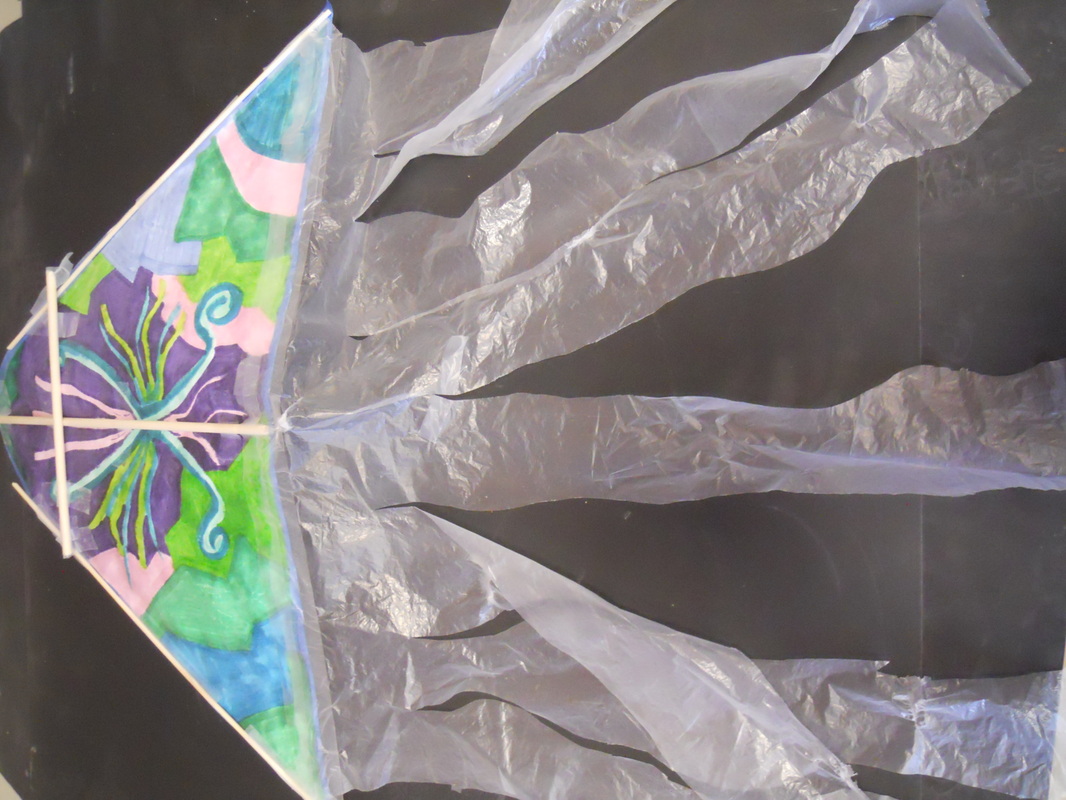
Above is a picture of my overall kite. Its design is completely random and I just went with the flow with no specific design in mind.
My designs were just random, I had no actual design ideas.
|
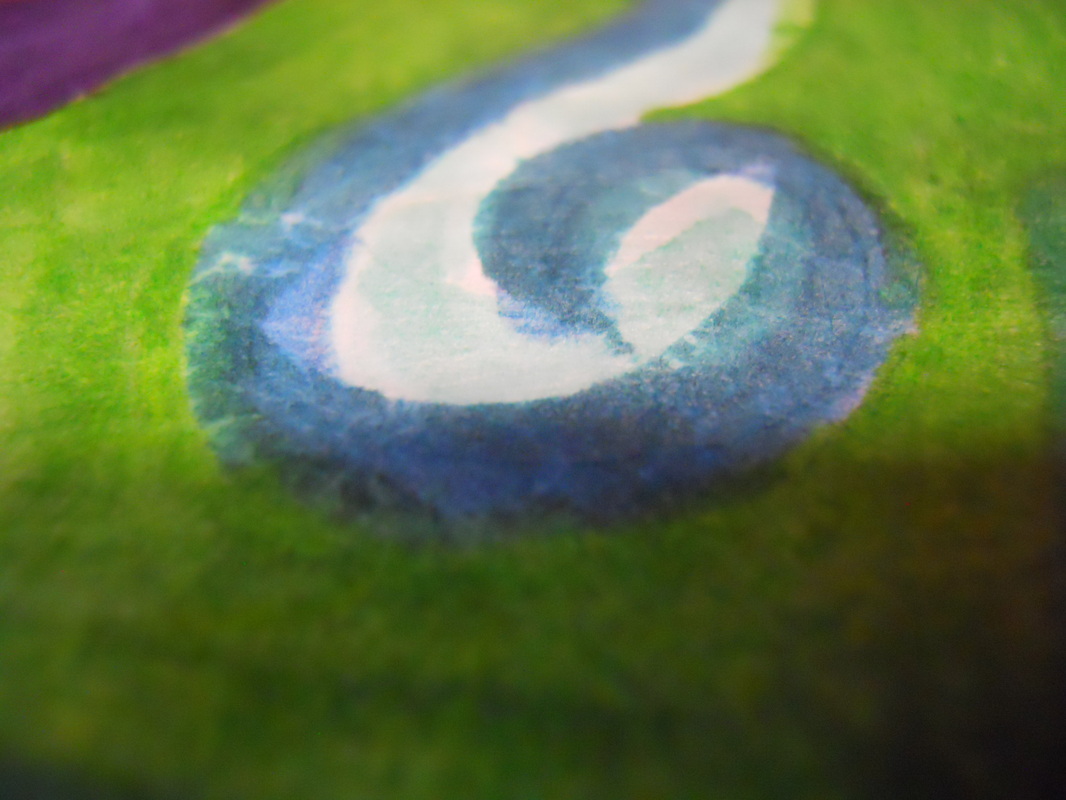
The picture above shows the swirly design I put into the kite.
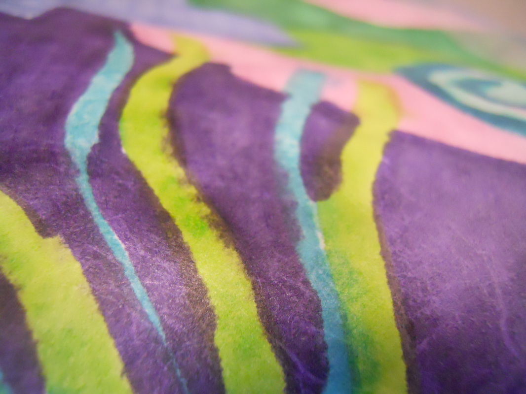
The picture above shows the streaks and accidental blending that occurred when coloring.
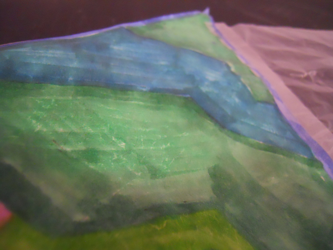
This picture shows the geometric shapes I drew on the kite.
|
1. The good and strong parts on my kite are the abstract designs all around because I took my time in making my design unique.
2. On my kite I think I could have done a better job on the actual coloring because it looks very messy and I know I could've done better.
3. My theme overall on my kite is the abstract view of it because its has abstract written all over it.
4. The balance is aymmetrical because of the shapes on the sides because they are al different shapes and colors.
5. I selected cool colors on my kite because I like to see nice pretty colors flying in the sky rather than dark mean colors.
6. What I learned from this project was the facet that you need color and beauty to bring out the meaning of a kite and how I could use this in daily life is to be bright and fun in life.
7. I did my kite abstract and wild because in the beginning I didn't know what to do so I just went with the flow and followed my path.
8. I would say that Mr. Purdy should make a choice between photography and making kites because it seemed like too much to get done and we had to much pressure upon us.
